Rebranding this luxury travel company to get them where they needed to be.
Rebranding this luxury travel company to get them where they needed to be.
The Challenge
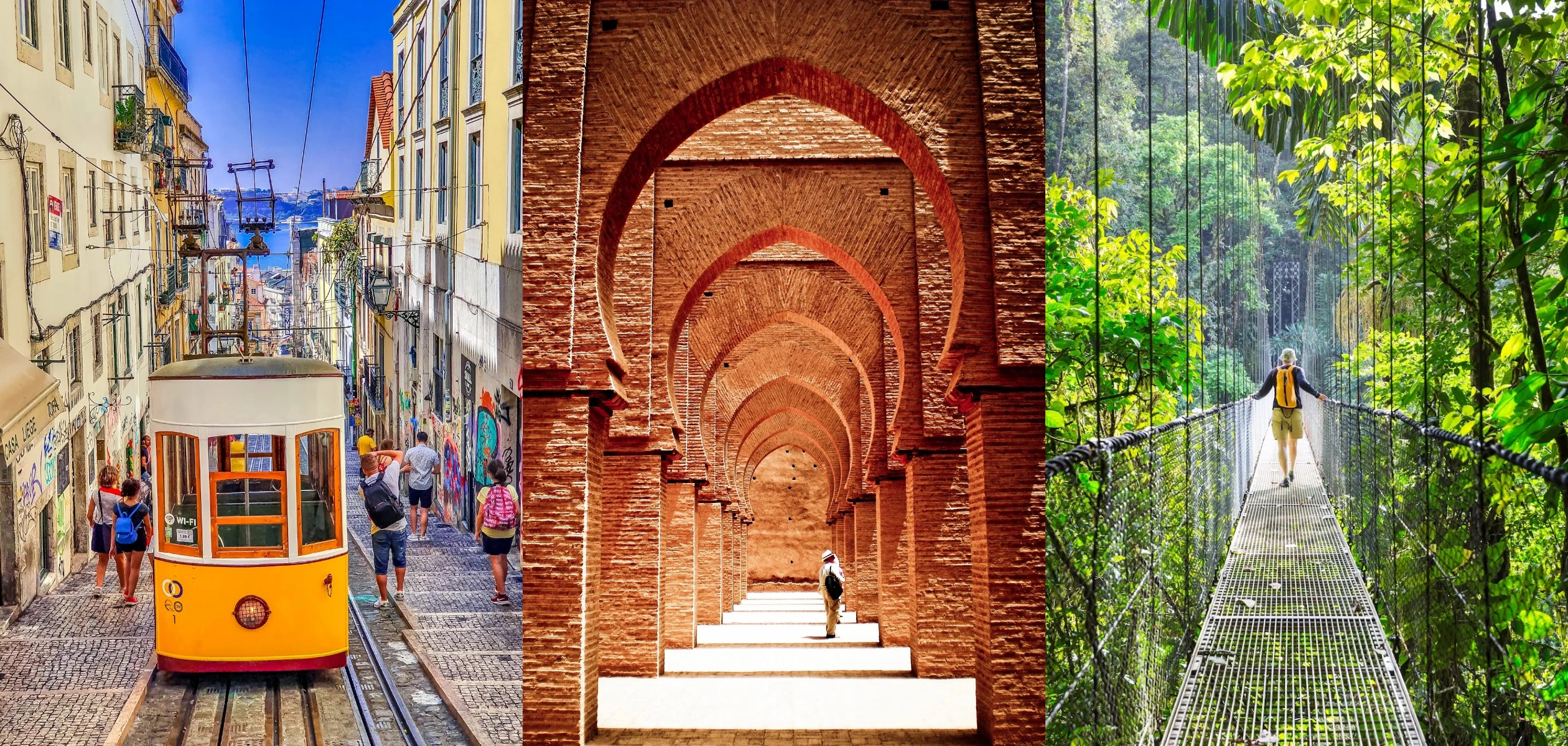
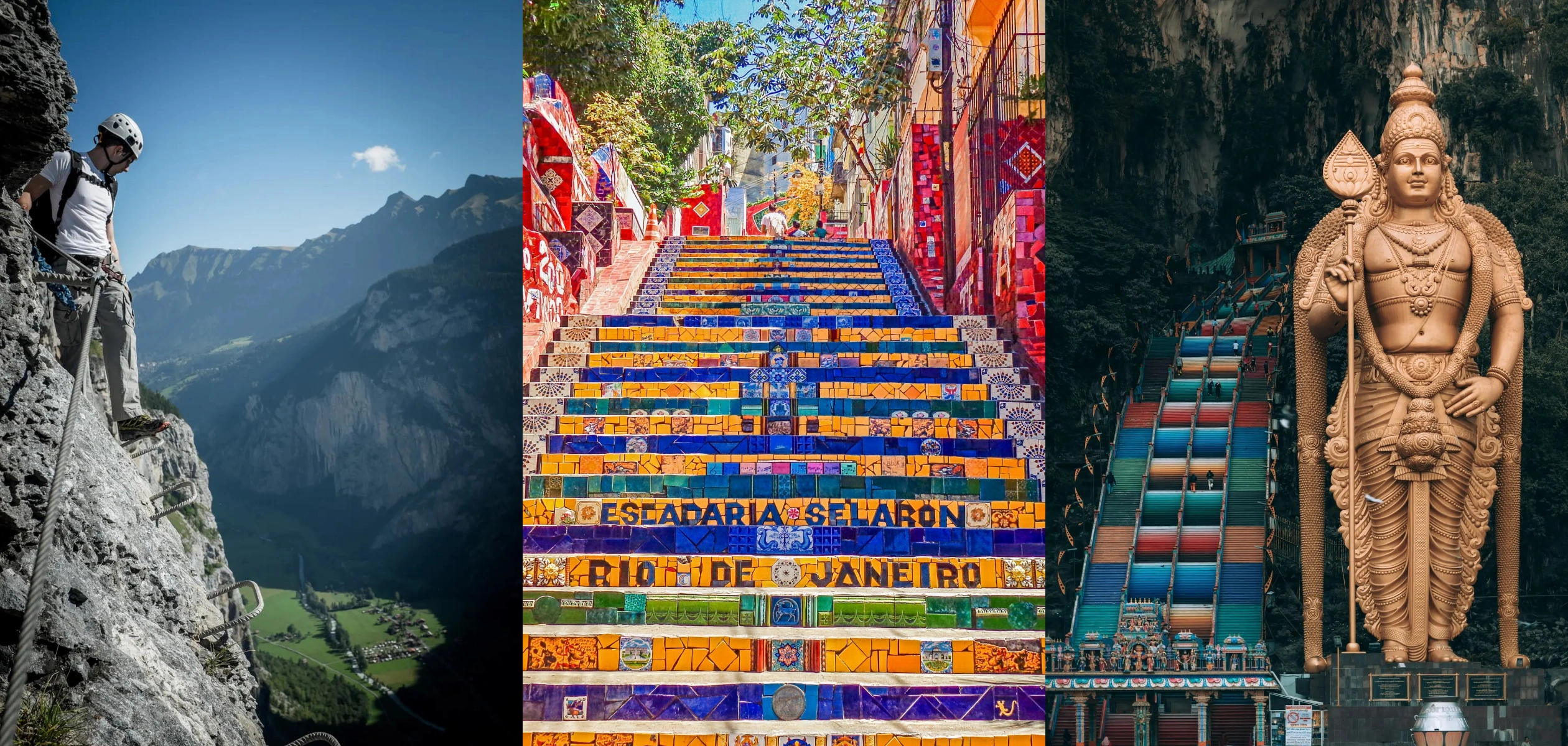
Rooted in Europe, inspired by the world—G/Hardy Tours began with a passion for crafting travel that transforms. Founded in 1987, G/Hardy Tours is a boutique luxury travel agency and destination management company based in Toronto. They specialize in custom-designed experiences — from student enrichment trips and cultural group tours to private, high-end vacations across Europe and beyond.
The brand had become dated and no longer reflected the high-level, tailored experiences and service that the company was known for. Our partner, Taylor+Wolfe, introduced us to G/Hardy Tours
The Solution
We collaborated with our entire team and our partner, Taylor+Wolfe, to gain a comprehensive understanding of the travel industry’s dynamics, the company’s brand and team passion, and their customer base. From there we created a complete package of marketing materials that positioned the company to better communicate with their ideal customers.
Since 2022, we’ve had the pleasure of working with Sherpa Creative. The team did a great job with our company’s brand refresh and we’ve been thrilled with the positive feedback.
Kathleen Hardy, Vice President, Product Development & Luxury Experience
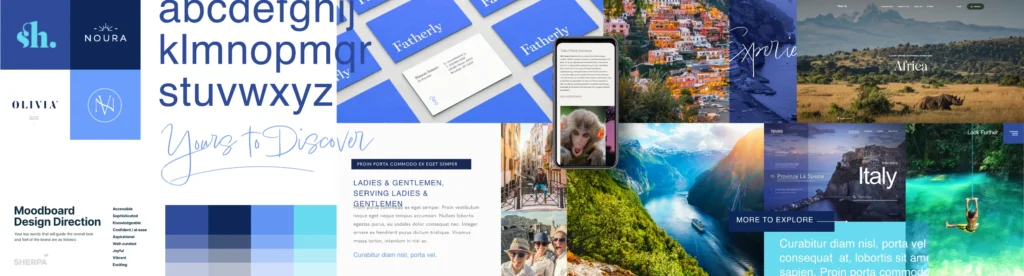
Making a plan is more effective when you know where you need to be and what you want to do. Our BrandMap framework allowed us to gain comprehensive insights into the company’s industry but more importantly, their vision and strategic direction.
CHARTING A NEW PATH
Based on the findings, we developed a customized solution for the brand that focused on the company’s strengths and value to their customers. The new brand focused on creating an aligned voice and personality to enhance brand recognition among their key demographics.
Positioning the brand with vision.
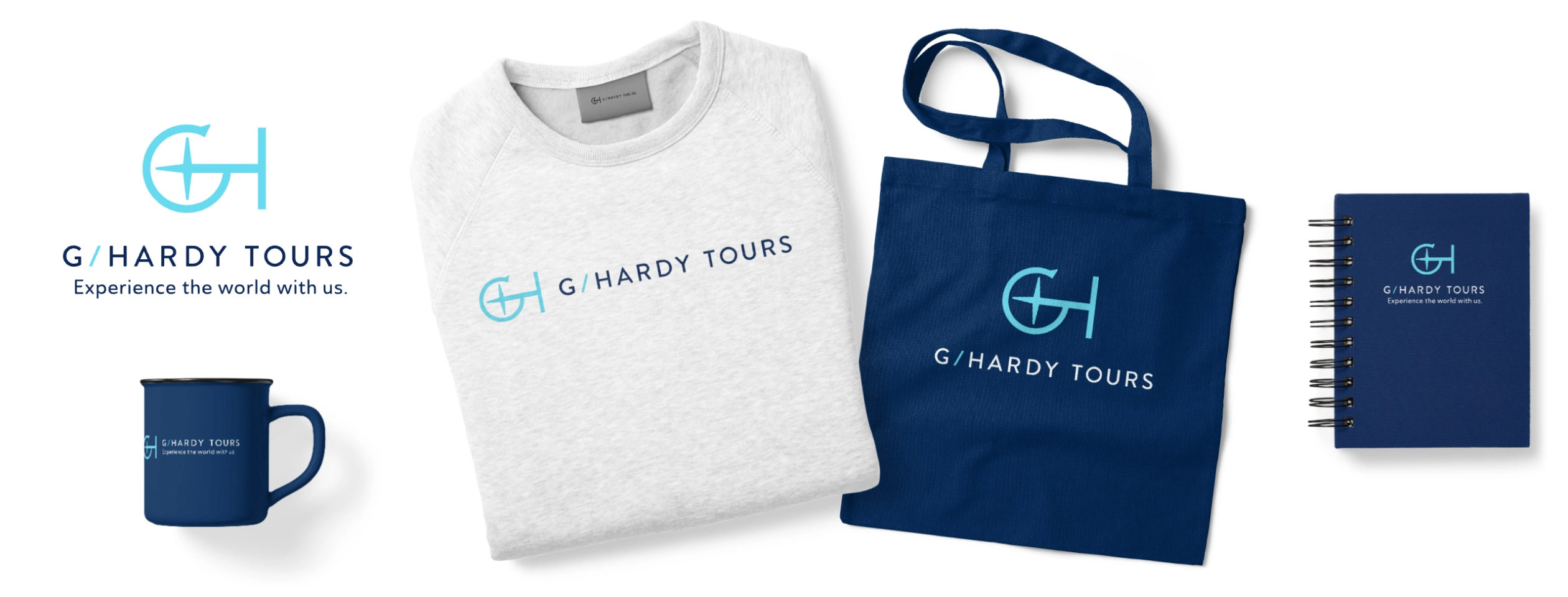
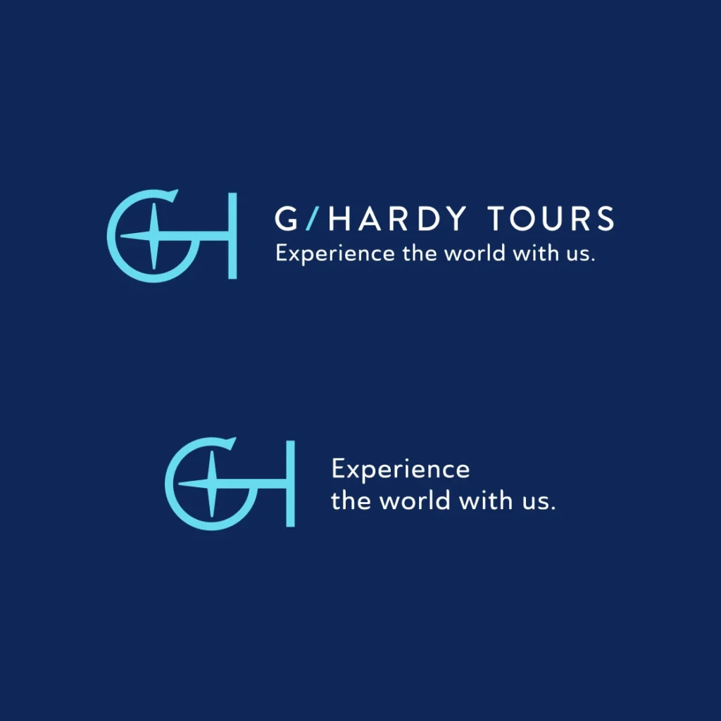
Developing a new identity
After selecting one of the concept directions, we worked with the team at G/Hardy to refine the design to relaunch within. Focus testing was completed to ensure the direction would resonate with their audiences.
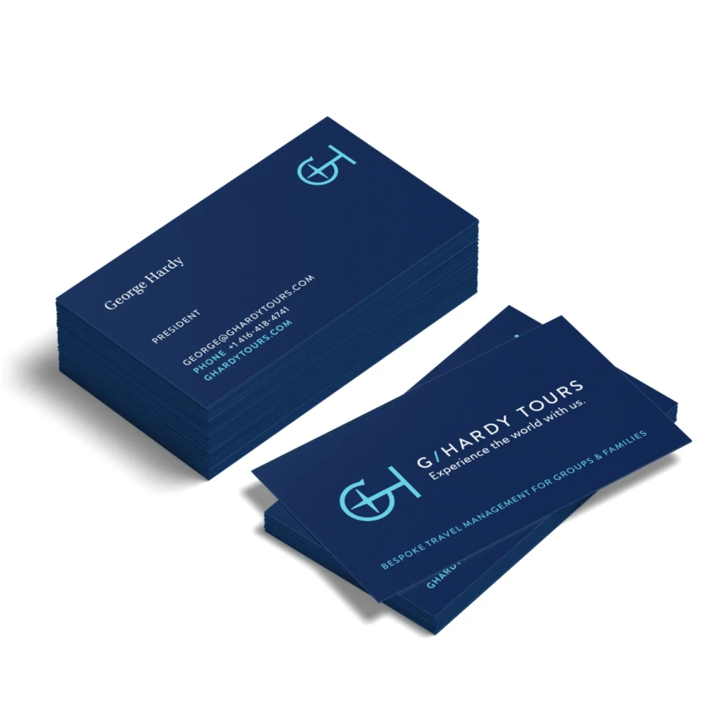
The logo is built as a mark + wordmark. To keep founder, Georgia Hardy, present in the brand, we created an icon using the initials G + H. We paired this mark with a contemporary clean, easy to read sans-serif face (Brandon Grotesque). Its open, simple forms offer legibility at very small sizes and when typeset wide. The point on the G suggests the arrow of a compass—the directional arrow that parallels the idea that G/Hardy guides their clients on amazing experiences.
Make a plan to get where you need to go.
Marketing Communications
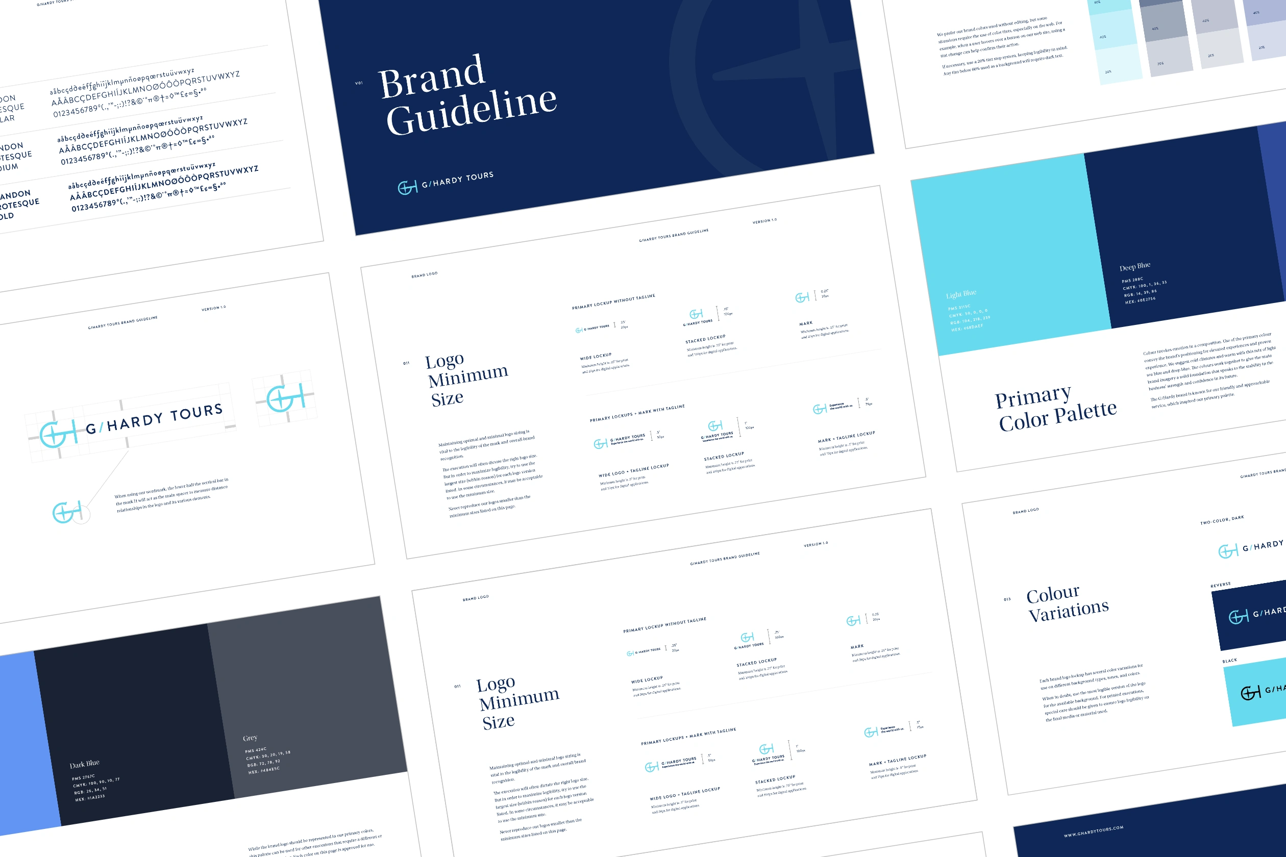
We established a detailed set of guidelines for further application of the brand. This served as a map for creating consistent touch points across their print and digital marketing efforts.
The brand guide enable their team to work with suppliers in the office, and during trips, to create consistently branded elements easily and as needed.
A comprehensive system of new typography, colour families, iconography, and guidelines for photography selection was developed to relaunch the brand.
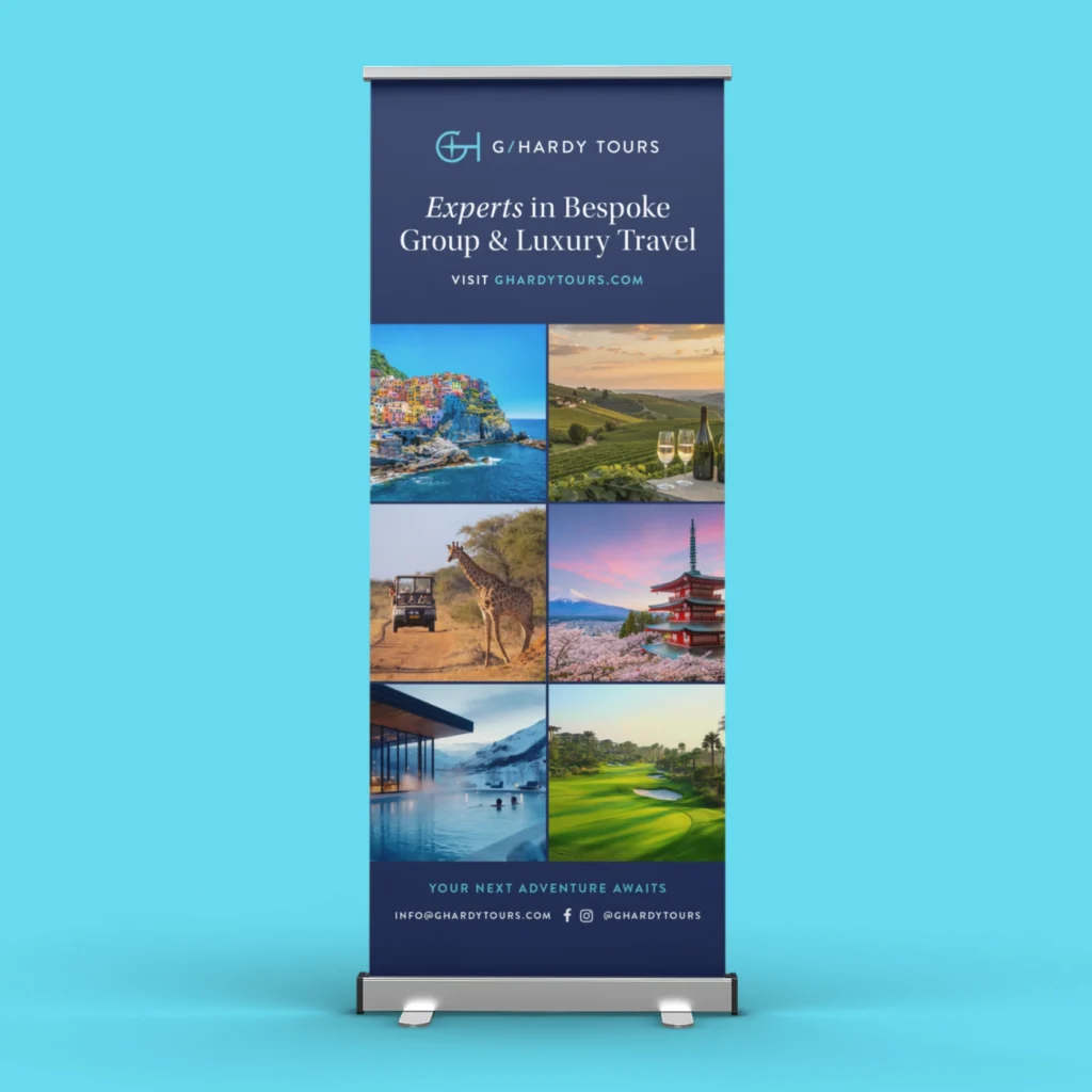
Roll up and roll out.
At HOME AND ABROAD, the brand speaks to your audience
Consistent branding application is essential for effectively communicating with customers across various touchpoints. By maintaining uniformity in visual elements such as logos, colour schemes, and typography across stationery, signage, email campaigns, presentation decks, promotionals, and travel documents, a brand reinforces its identity and fosters trust.
We built a cohesive approach to help ensure G/Hardy customers recognize and connect with the brand seamlessly, regardless of the communication channel, thereby enhancing brand recognition and credibility.
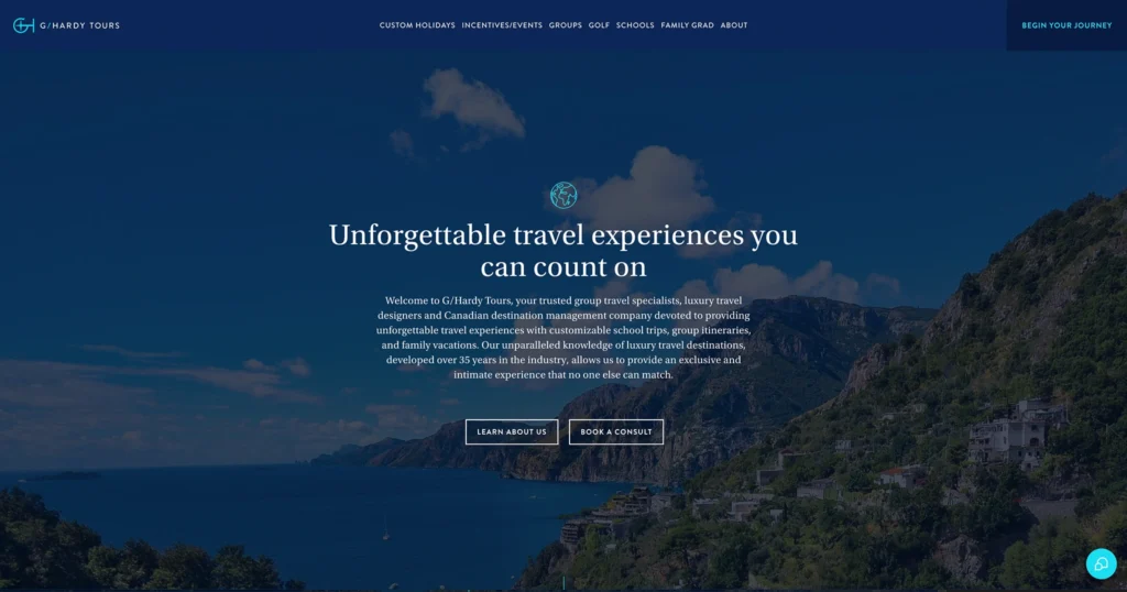
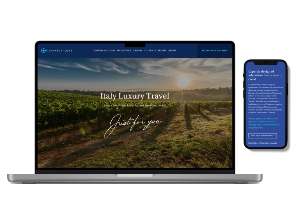
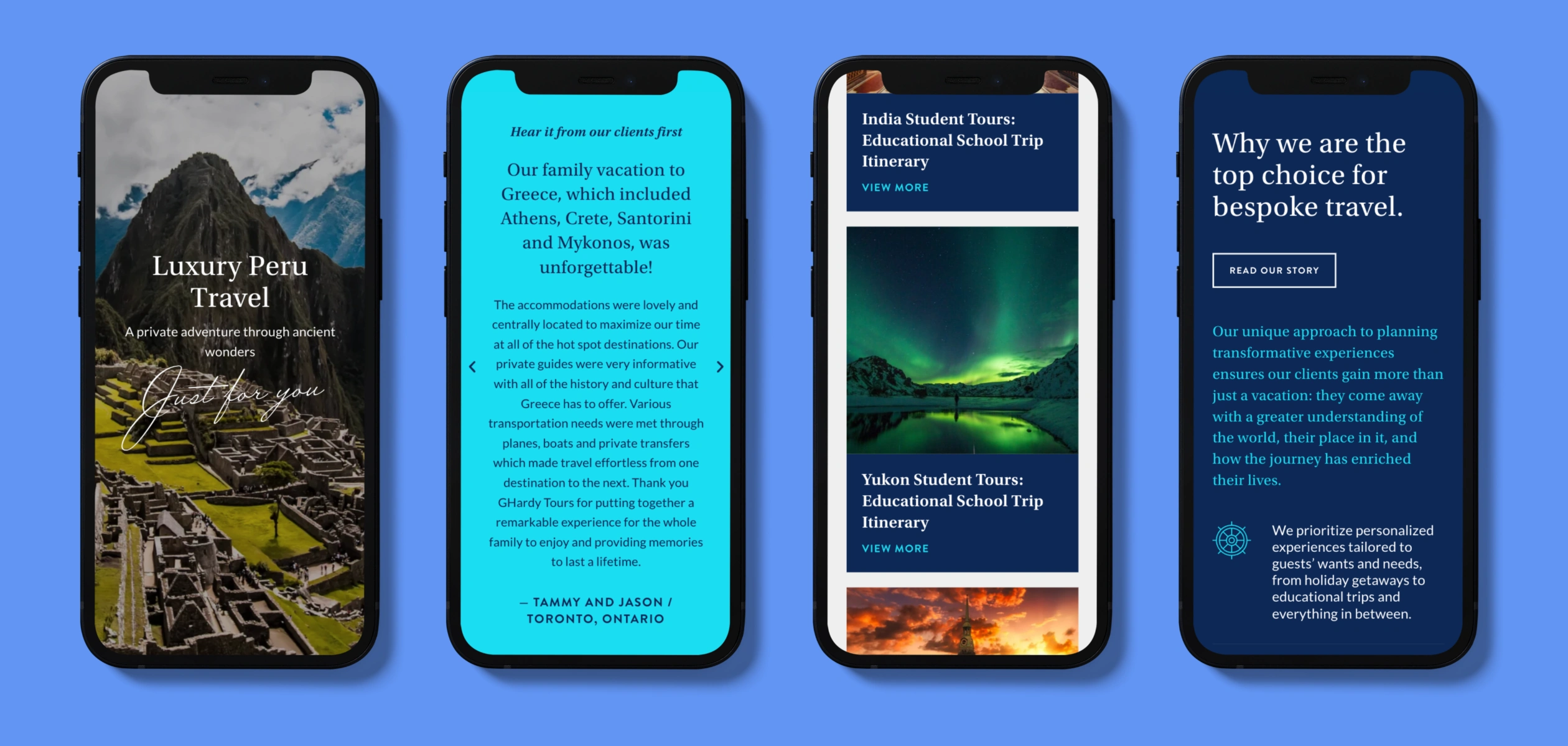
Arrive at our online destination.
STAMP THAT PASSPORT, YOU'VE ARRIVED
During the initial briefing phase, the team at G/Hardy outlined the importance of a visually stunning site to better communicate the possibilities and extent of their service. The site was planned around an improved navigation / site map to properly define the focused service areas. New, custom forms were set up to enable visitors to request the trip booking / destination details online.
The responsive site was built to expand, new trips and destinations, as well as new travel details could be added easily while keeping it styled to match the site.
Conclusion
The visual elements and positioning of the new brand were realigned with the company’s core focus on delivering personalized, luxury travel experiences for their key audiences. These strategic enhancements enabled their team to quickly advance business objectives and confidently recommend their services to discerning clients. The customer was able to experience the service at first interaction with the brand.
The team at Sherpa was super responsive to our needs and requirements and executed quickly – on time, and on budget. Sherpa is our go to shop for all design, brand and marketing needs.
Kathleen Hardy, Vice President, Product Development & Luxury Experiences
Sherpa Creative’s BrandMap process helps you confirm your business goals and get laser-focused on your audience and strategy. Establishing these baseline decisions from the start avoids costly pivots that come from having to redo creative elements built on a whim. Let Sherpa’s established process help your business get your branding right the first time and build a solid foundation to reach your target audiences.