Established New Brunswick-based exploration and development company, Canadian Copper, needed a new, aligned brand to position them for growth.
Established New Brunswick-based exploration and development company, Canadian Copper, needed a new, aligned brand to position them for growth.
The Challenge
Having recently renamed the company, New Brunswick-based mining exploration and development company, Canadian Copper, wanted to rethink how their brand was to be positioned. It needed a better way to convey a new, better vision for mining exploration—a vision of net zero exploration while bringing life back to historic mining projects.
The Solution
Our BrandMap process facilitated a deep dive into Canadian Copper’s brand value and helped us position them in the right direction. The result was a thoughtful, modern design that provided a new look and a new voice for the company. This direction would flow through all communications to ensure a consistent position for their key audiences.
A previous company I hired had provided no value add and creativity, but a switch to Sherpa allowed me to choose between different designs. I needed someone to take my vision and put it on paper.
Despite being an established company in a longstanding industry, the client realized the value in drilling down anew into the business. With our BrandMap session, we explored the different areas of the business and discussed everything from the long and short business goals to the company’s personality.
“The questionnaire they provided asked for our top elements, everything from colour to what animal would your business be. It really prompted my creative thinking.”
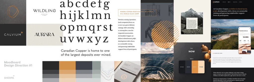
Creating a new direction
Through the BrandMap discussion, we helped the client to confirm multiple key targets and focal points for the brand and its stake within the Canadian mining industry. The results of the 30+ page report provided a solid understanding to strategically plan the mood boards. Using image, fonts, colour, and layout we created concept road maps for the new brand.
“The mood boards were very helpful: they allowed me to select what I liked and didn’t in terms of colour and styles.”
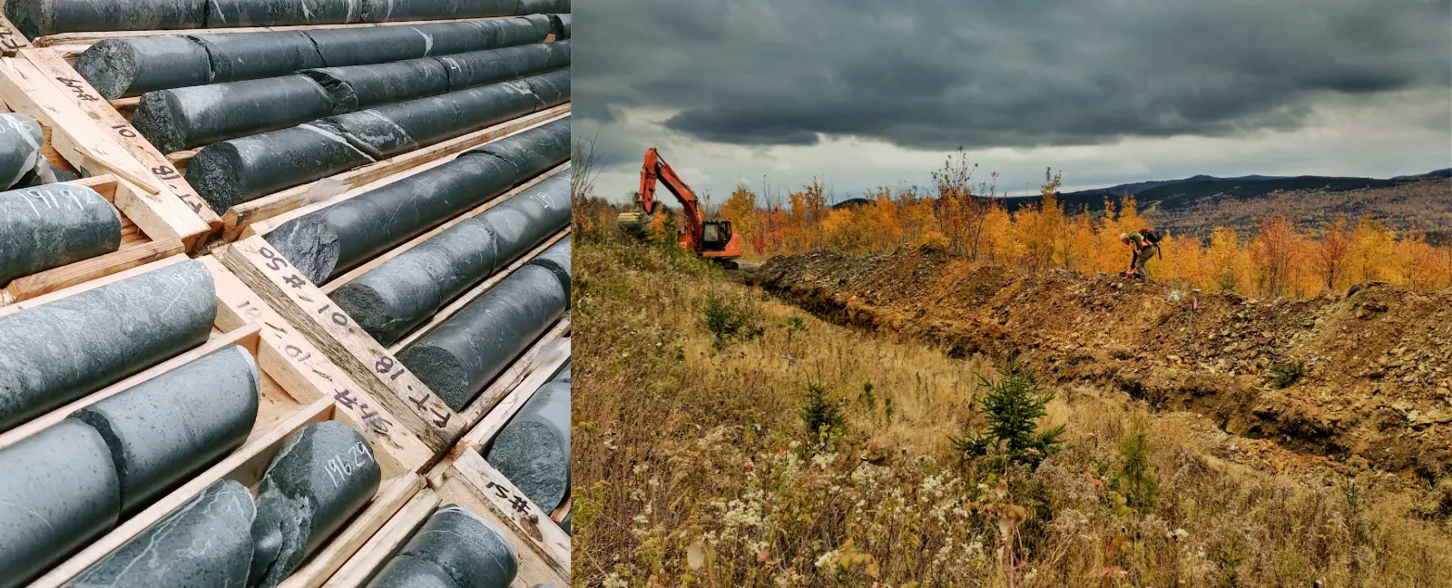
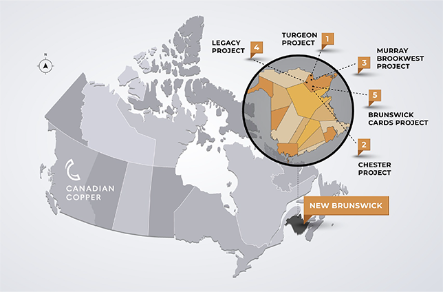
Valued properties
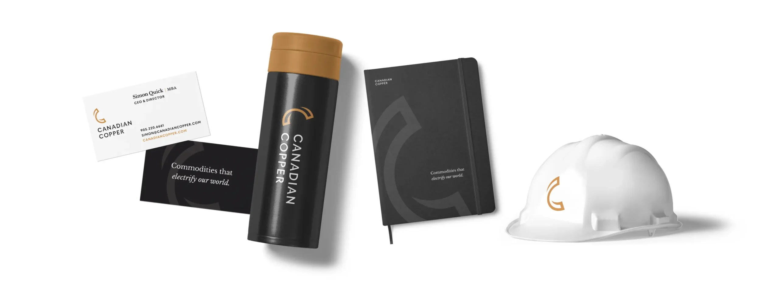
Developing a new logo and tagline
We wanted an identity that respected the seriousness of the Canadian resource industry but also added a bit of personality. The symbol is of processed rolled copper that allows for a doubled-up letter C, for the company name. It is a distinct symbol that is easily reproduced for a variety of applications.
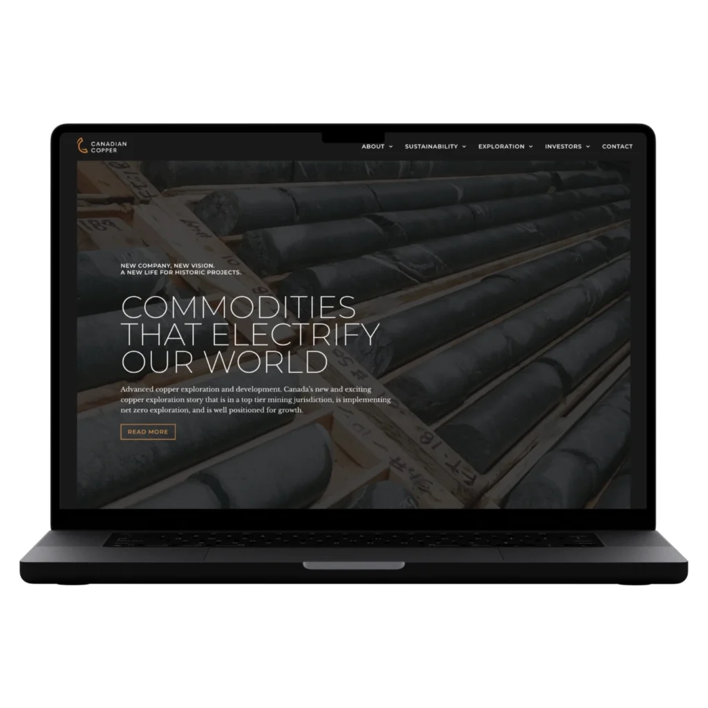
The tagline ‘Commodities that electrify our world’ was added to help communicate the value of the company to potential investors.“It was something I knew about our business but couldn’t articulate! I loved it right away.”
The combination of serif and sans serif typography creates a sophisticated and confident look for the new company that aligns with their responsible approach to the industry.
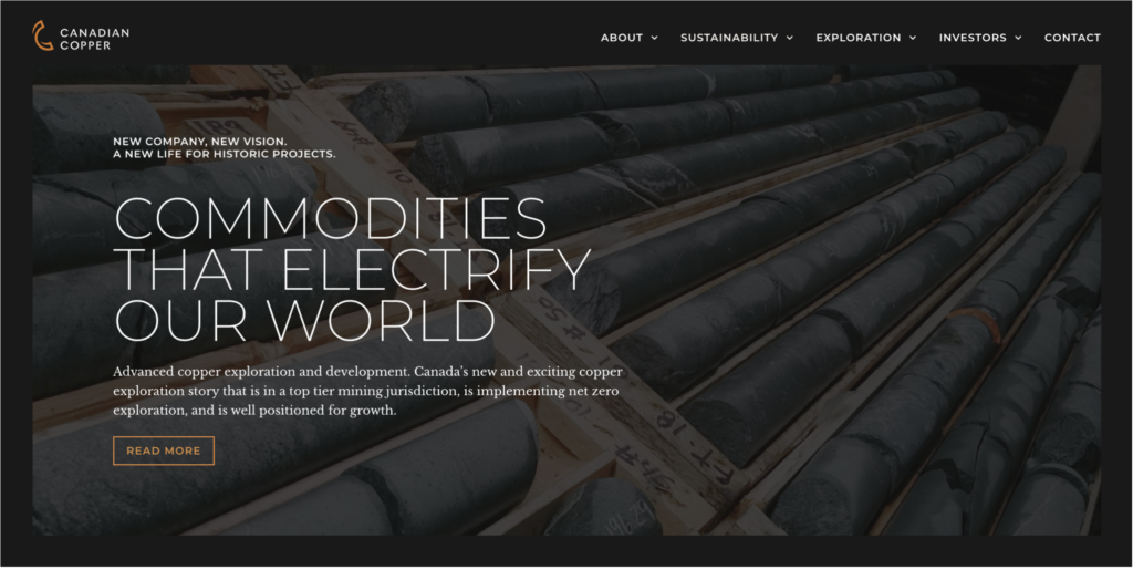
Relaunching with a new vision
On site and Online
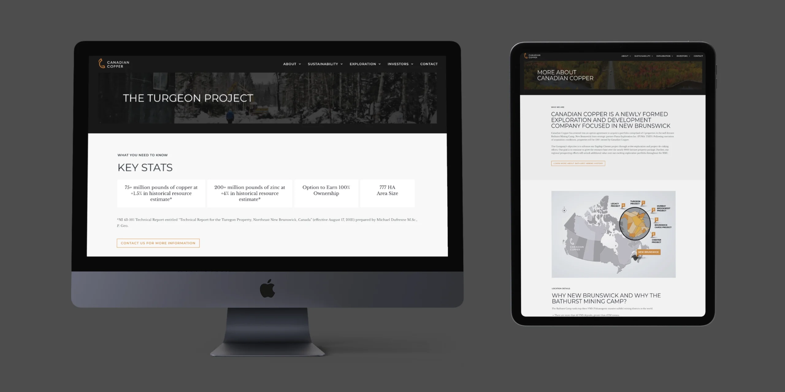
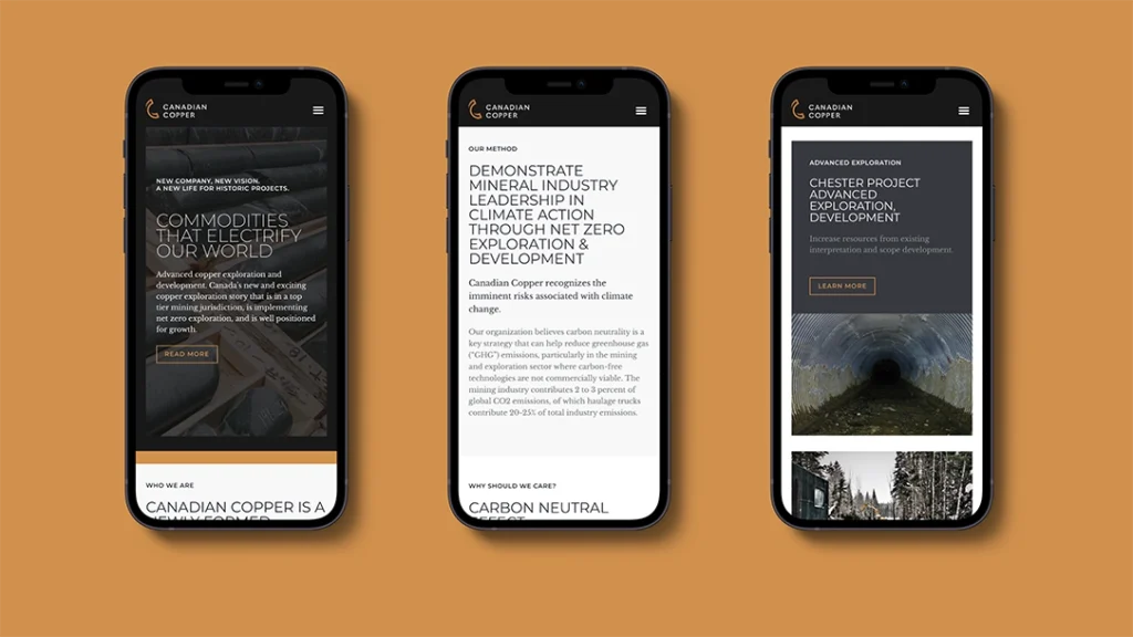
Creating wireframes of the entire website enabled us to visualize the overall content and navigation as it would appear to both new and current investors.This allowed the clientto view a prototype of the eventual website structure before we added visual elements and colour.
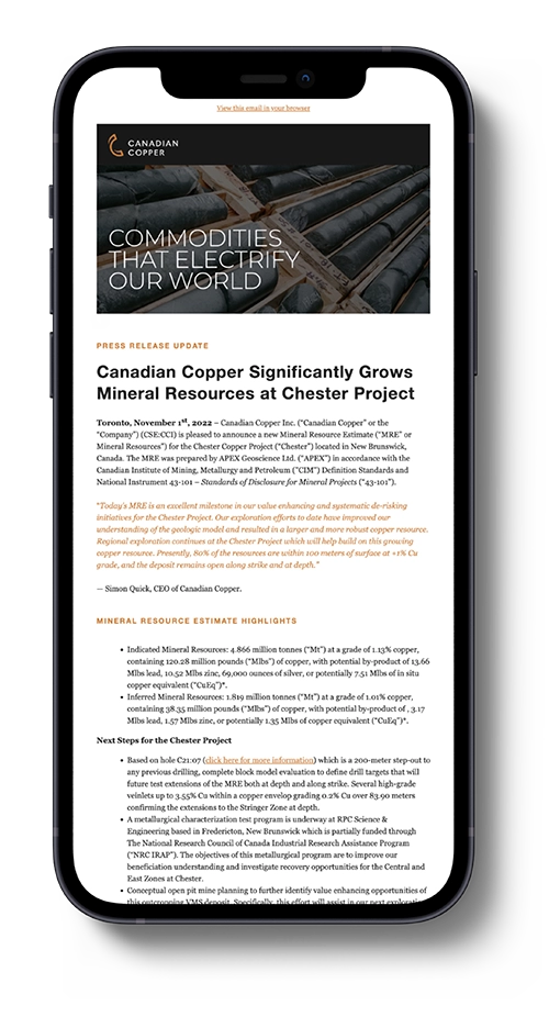
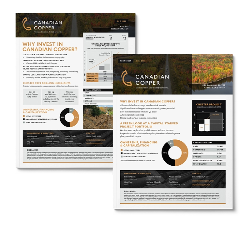
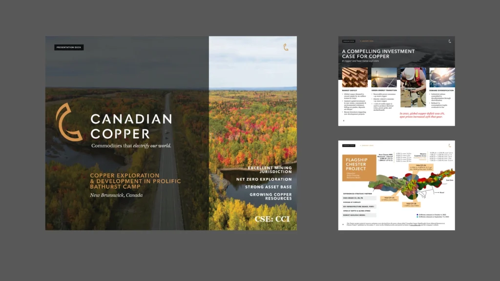
The site needed to be an effective tool for the company, so we ensured all the site content was in line with the new brand and that image and word worked together to enhance the communication.
Communicating the brand value in exploration and development is key to positioning the company’s stock potential so we worked to bring the supporting visual reference material in under the brand where possible. This helps present a professional and identifiable image for the company.
Invested in Communications
The brand is in the message
Developing the marketing collateral that would allow Canadian Copper to reach out to its audiences was a natural flow. For the client, it meant gaining confidence that each piece would be consistent for the target audience.
Areas of the brand that needed focus were outlined in the BrandMap so we knew what was required at any point in the project. We were accessible and able to handle a range of design projects from the website to news release templates. “Sherpa works quickly, they’re not bureaucratic and they’re able to help with many creative projects”
Conclusion
With the new brand in place, the client was confident that the company could grow its appeal to a wider audience and increase the visibility and legitimacy they needed.
The results were wonderful. I couldn’t be happier.
Sherpa Creative’s BrandMap process helps you confirm your business goals and get laser-focused on your audience and strategy. Establishing these baseline decisions from the start avoids costly pivots that come from having to redo creative elements built on a whim. Let Sherpa’s established process help your business get your branding right the first time and build a solid foundation to reach your target audiences.